


Welcome to the era of seamless digital experiences, where responsive web design takes center stage. In this comprehensive guide, we embark on a journey to master the art of responsive web design—exploring its evolution, impact on user experience, best practices, and successful implementation.
Art of Responsive Web Design
The Evolution of Responsive Design | Art of Responsive Web Design
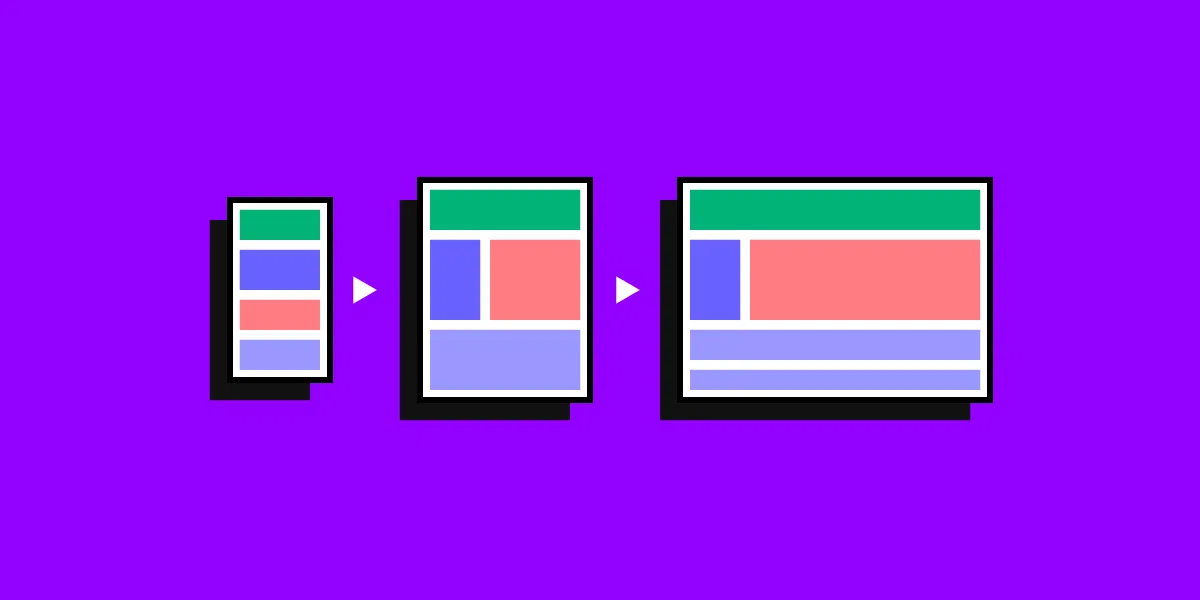
Responsive web design has come a long way since its inception. Initially introduced as a solution to the challenges posed by the proliferation of diverse devices, it has evolved into a fundamental aspect of modern web development. The rise of smartphones and tablets necessitated a shift from fixed-width designs to layouts that could adapt to various screen sizes.
Mobile-First Approach: Best Practices
Embracing a mobile-first approach is no longer an option; it’s a necessity. With mobile users surpassing desktop users, prioritizing mobile design ensures that your website delivers a compelling experience on smaller screens. We delve into the best practices of the mobile-first approach, emphasizing efficient navigation, optimized images, and touch-friendly interfaces.
User Experience (UX) and Its Role
User experience is at the heart of responsive design. A website that seamlessly adapts to different devices enhances user satisfaction and engagement. We explore the crucial elements of responsive design that contribute to a positive UX, including fast loading times, intuitive navigation, and content prioritization.
Common Challenges and Solutions
While responsive design brings numerous benefits, it comes with its share of challenges. Addressing issues such as image optimization, content hierarchy, and performance optimization is paramount. We provide insights into common challenges faced during responsive design implementation and offer practical solutions to overcome them.
Case Studies: Successful Responsive Design Implementation
Nothing speaks louder than success stories. We showcase real-world examples of websites that have successfully implemented responsive design. From e-commerce platforms to content-driven websites, these case studies demonstrate the transformative power of responsive design in enhancing user engagement and driving results.
Media: Visualizing the Transformation
To guide you through the concepts discussed, we’ve incorporated visual elements. Infographics, before-and-after snapshots of websites, and interactive images illustrate the impact of responsive design. Explore the visual side of responsive design to gain a deeper understanding of its transformative capabilities.
In conclusion, mastering the art of responsive web design is not just a trend—it’s a crucial element of a successful online presence. As technology continues to evolve, embracing responsive design ensures that your website remains accessible, user-friendly, and visually appealing across all devices.
Ready to elevate your web design? Dive into the world of responsive design and set the stage for a digital experience that resonates with your audience.
Feel free to customize this blog post further based on your preferences and the specific details you want to highlight.
what image do i add
ChatGPT
Choosing the right images for your blog post on responsive web design is crucial to visually convey the concepts and showcase the transformations. Here are some image ideas you can consider adding:
- Responsive Design Examples:
- Include before-and-after screenshots of websites to visually demonstrate the impact of responsive design on different devices. Showcase a variety of industries, such as e-commerce, news, and blogs.
- Infographics:
- Create infographics that highlight key statistics about the importance of responsive design, the growth of mobile users, and the benefits of a mobile-first approach. Visualize data to make it more engaging for your readers.
- Mobile-First Icons:
- Use icons or illustrations representing mobile devices, tablets, and desktops to visually represent the mobile-first approach. This can add a visual element to your content and break up text sections.
- User Experience Visualization:
- Incorporate visuals that represent positive user experiences on responsive websites. This could include graphics of users interacting with content on different devices, emphasizing ease of navigation and readability.
- Challenges and Solutions Graphics:
- Create graphics or illustrations that represent common challenges in responsive design and visually convey the solutions. This could include images of website elements being optimized for various screen sizes.
- Case Study Screenshots:
- Include screenshots or images from the case studies you discuss in the blog. Highlight specific elements of the websites that were transformed through responsive design.
- Technology Icons:
- Use icons representing the technologies and tools associated with responsive web design, such as CSS frameworks and mobile optimization tools. This can visually represent the technical aspects of the topic.
